If you’re a brand manager or marketer in the food and beverage space, you already know how much a label can influence a consumer’s split-second decision at the shelf. Between flavor innovation, regulatory hurdles, and crowded retail environments, it’s hard enough to get noticed—let alone remembered.
An effective food and beverage label design needs to do more than identify what’s inside the package. It must convey value, spark emotion, and align perfectly with your brand promise. And it has to do all that in under five seconds.
Here at Systems Graphics, we’ve worked with food and beverage brands ranging from local startups to national favorites. Our experience has taught us that the best label designs aren’t just “pretty”—they’re rooted in strategy. That requires understanding the psychology behind consumer behavior and applying design principles that prompt connection, trust, and conversion.
Let’s look at what really drives consumer response to food and beverage label design—and how you can design smarter before going to print.
Have a food or beverage label needing perfect printing? Connect with a consultant.
Basic Strategy in Food and Beverage Label Design
Color Psychology: The Science And Significance Behind Color Selection
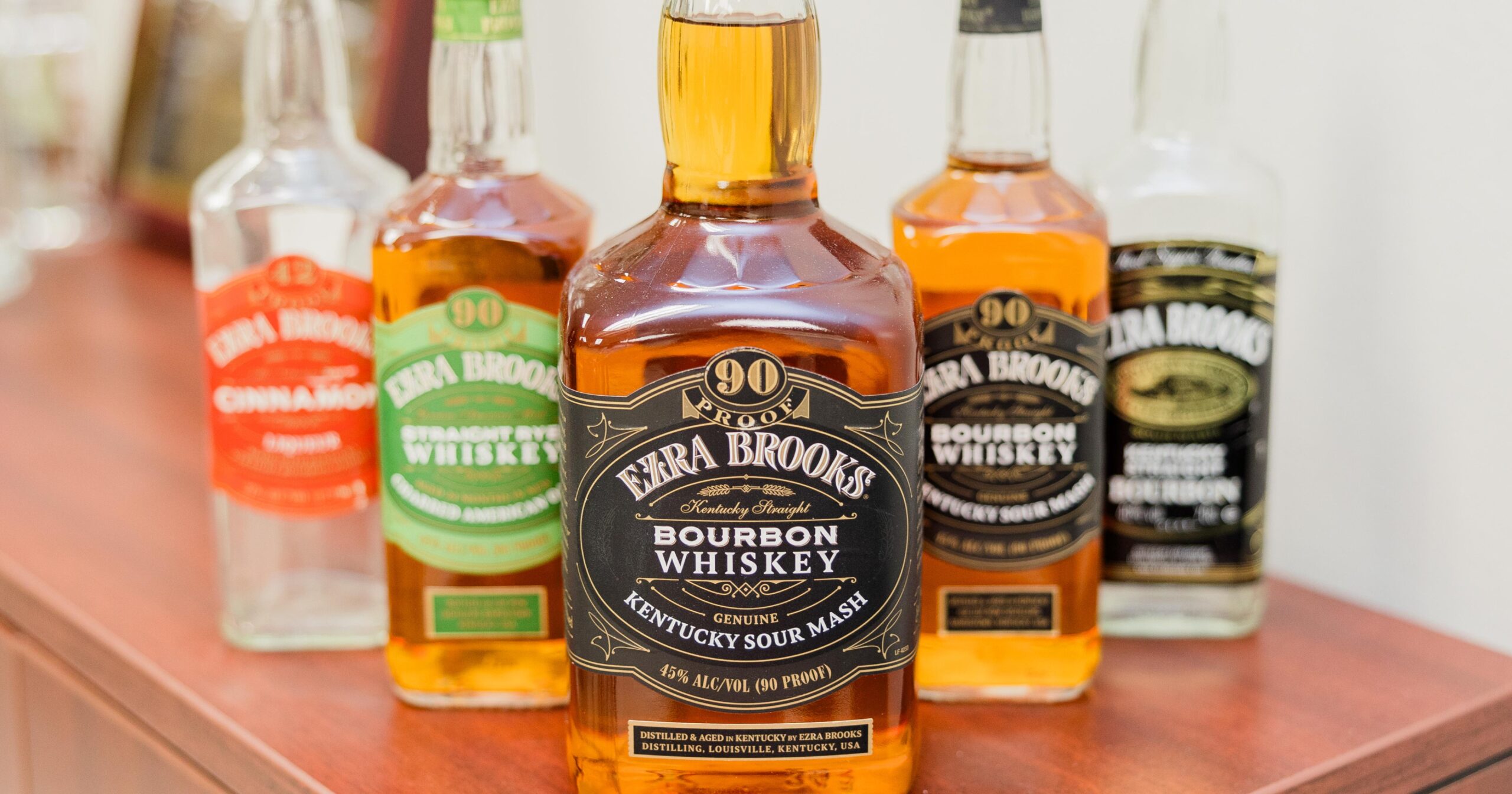
Color selection is not as simple as just picking one that you like or think looks good. Research in consumer psychology and packaging design consistently shows that color plays a critical role in how products are perceived, influencing emotions, brand associations, and purchase decisions.
Color is often the first thing a consumer registers, even before reading a single word. That makes it one of the most important tools in your design arsenal. Effective color selection involves:
- Strategic Alignment: Assessing how the chosen palette complements your product category
- Consumer Expectations: Meeting or intentionally challenging what consumers expect for your market segment, which can affect trust and attraction.
- Shelf Impact: Standing out among competing products, considering that shoppers are exposed to hundreds of options in a crowded retail environment.
Here are some key color-emotion associations in food and beverage label design:
-
- Red suggests excitement, energy, and urgency, used to convey bold, dynamic, and attention-grabbing brand personalities, but can also decrease perceived reliability if misapplied (e.g., often used for snacks and sauces).
- Green is associated with health and environmental responsibility, used to signal freshness, sustainability, and well-being—especially effective for eco-friendly or wellness brands.
- Blue is most strongly associated with trust and cleanliness, frequently used for conveying reliability and calm (e.g., a common favorite in bottled water and dairy).
- Black typically denotes sophistication, formality, or maturity and can also evoke a sense of luxury or seriousness, depending on category and context.
- White creates a sense of simplicity, purity, modernity, and elegance.
- Gold can be leveraged to imply luxury and premium positioning.
Label example: A candy label using subdued earth tones, for example, might get overlooked next to neon competitors—even if it’s the better treat.
Layout and Legibility: Where Function Meets Form
Once a color draws someone in, your layout needs to do the heavy lifting. Shoppers don’t linger to analyze labels—they skim. That makes clarity key. Here are a few principles to guide your approach to layout:
- Hierarchy: What do you want your audience to see first? Brand name? Product benefit? Callout? Effective visual hierarchy helps consumers quickly grasp the most important information, promotes brand recognition, and improves user experience
- Typography: Choose fonts that reflect your brand but also pass the squint test. When using multiple, be sure they’re distinct yet complementary.
- Whitespace: Don’t cram every inch of the label—a bit of breathing room allows important information to stand out.
Designing for readability is especially crucial on small-format packages like beverage bottles, snack bars, or condiments. If your message doesn’t land at a glance, you’re missing opportunities.
Label Claims: Building Trust and Appeal
Claims like “organic,” “non-GMO,” or “sugar-free” can be powerful conversion tools—but only when used honestly and appropriately. Consumers rely on quick cues to make healthy or values-driven choices. However, overloading your label with claims can lead to confusion or skepticism. Strategic placement and prioritization are key. Think about factors like:
- Relevance: Does the claim reflect a top priority for your target customer?
- Credibility: Is the claim backed by certification (USDA, NSF, Non-GMO Project)?
- Clarity: Are you using simple language and placing claims in easily visible areas?
As always, be sure to double-check that your claims meet FDA or USDA guidelines to avoid compliance issues.
High-End Finishes That Trigger Perception
Even subtle enhancements in texture or finish can make a huge difference in perceived value. When consumers touch or see something different, it creates a multisensory experience that enhances brand recognition. Premium packaging cues might include:
- Soft-touch or matte lamination for a tactile luxury feel
- Spot varnishes to highlight logos or key messaging
- Cold foil or metallic inks to create shimmer and dimension
These upgrades help products command higher price points and stand out in premium grocery, specialty, or direct-to-consumer channels. When used tastefully, they signal that what’s inside is worth paying more for.
Balancing Appeal With Regulatory Compliance
One of the hardest parts of food and beverage label design is marrying creativity with regulatory precision. Yes, your label should look good—but it must also follow strict guidelines for nutrition facts, ingredient listings, allergens, and barcode placement. Smart brands start thinking about compliance early so that design intent doesn’t outpace feasibility.
One important note: even the most thorough attention to detail can’t save your compliance from a production error. Misaligned labels and botched barcodes can set you back days or weeks. You need a print specialist you can count on to get it right the first time.
At Systems Graphics, we routinely help clients by catching avoidable errors early and delivering timely, cost-effective, and consistent results every time. Nothing derails a launch like having to reprint an entire run due to a botched detail or misprint.
Design With Strategy. Print With Confidence.
Great food and beverage label design is a unique blend of artistry and behavioral science. When done right, a label can nudge a shopper toward your product, communicate your brand story in a flash, and validate their decision with every detail.
But even the best designs can fall flat if they aren’t printed to perfection. That’s where Systems Graphics changes the game—we work hand-in-hand with food and beverage brands to bring their design vision to life with color-accurate, compliant, and high-quality labels that elevate product appeal.
Whether you’re launching a new SKU, refreshing an existing line, or preparing for expansion into retail, we’re here to help you print with purpose. Let’s bring your food and beverage label design to life with precision, beauty, and shelf impact.