Picture this: a potential customer is standing in the aisle, scanning dozens of similar products. They’ve got about three seconds to decide whether your product is worth a closer look. In that brief moment, your custom label design becomes a deciding factor in your sales: the difference between success and a missed opportunity.
Great products don’t sell themselves. Even the best formulation or most innovative features won’t matter if your product gets lost in the visual noise of retail shelves. Sometimes, the difference between products that fly off the shelves and those that gather dust is as simple as the basic visuals.
Here, we share about the untapped potential of strategic design and the design elements that drive purchase decisions.
If you’re ready to make the most of your custom label design, start a conversation with one of our consultants.
What You Should Know About Custom Label Design
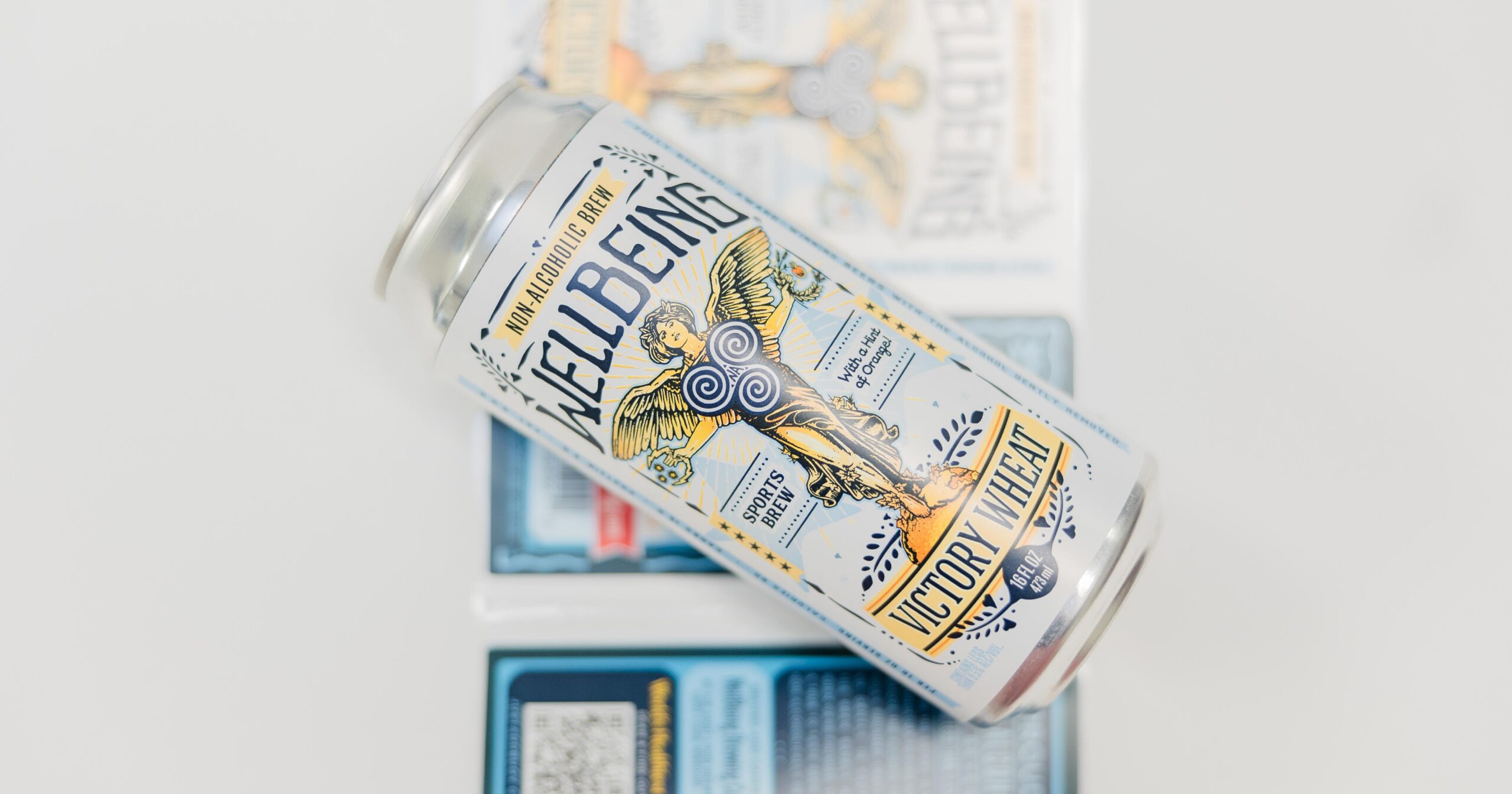
It’s easy for new brand managers to forget that effective label design isn’t necessarily about looking pretty. The best designs create a visual system that communicates value, builds trust, and compels action—all while navigating the complex requirements of regulatory compliance and production realities.
Grabbing Attention on the Shelf
Common marketing wisdom says you’ve got three seconds to grab a consumer’s attention when their eyes pass your product on a shelf. Retail environments are becoming increasingly cluttered, and consumer attention spans only continue to shrink. Your custom label design needs to work harder than ever to break through and create meaningful connection with shoppers.
Owning the Gaps in Popular Design
The most successful consumer product brands understand that shelf differentiation starts with understanding your competitive landscape. Try walking the aisles where your products live. What colors dominate? What design styles are overused? Where are the visual gaps that your brand could leverage to stand out?
Smart label design might mean going left when everyone else goes right. If your category is dominated by bold, aggressive graphics, a cleaner, more minimalist approach might be exactly what catches attention. If everyone’s using similar color palettes, introducing an unexpected but appropriate color can make your product pop.
The key is differentiation that feels authentic to your brand story. Visual distinction for its own sake rarely works—but differentiation that reinforces your brand’s unique value proposition creates both shelf impact and deeper brand connection.
Material and Finish: The Tactile Advantage
The strategic use of materials and finishes can go a long way toward enhancing perceived value and creating a memorable brand experience. These elements work on both conscious and subconscious levels to influence purchase decisions. Consider how different materials and finishes communicate different brand attributes:
- Matte finishes suggest sophistication and premium positioning.
- High-gloss surfaces convey energy, freshness, and mass appeal.
- Textured materials create tactile interest and premium perception.
- Metallic accents add luxury cues and shelf visibility.
- Clear labels offer clean, modern aesthetics and product transparency .
The smart approach lies in matching your material choices to your brand positioning and target customer expectations. A premium skincare brand might leverage soft-touch coatings and subtle metallics, while an energy drink could benefit from high-impact holographic elements that create shelf buzz.
The Compliance-Creativity Balance: Constraints as Opportunities
It’s easy to dismiss regulatory requirements as creative killers, but experienced designers know that constraints can actually fuel superior creative solutions. The trick is building compliance requirements into your design strategy from the beginning.
Start by understanding exactly what information your labels must show (and how). FDA requirements, nutritional panels, warning statements, and ingredient lists—these aren’t obstacles to work around, but necessary design elements that can trigger strategic creativity.
Small-Batch Success: Design Strategies That Scale Down
In industries like wine and spirits, small-batch SKUs present unique design challenges—but they also open up meaningful opportunities. Without the volume economies of major product lines, every design decision needs to work harder to justify its cost. But small batches also offer creative freedom that major SKUs rarely enjoy.
For small-batch products, focus your custom label design investment on elements that create maximum impact:
- Prioritize distinctive color choices that make your product unmistakable on the shelf, even from a distance. A unique color combination can provide more differentiation than complex graphics at a fraction of the cost.
- Leverage typography as a primary design element. Custom or distinctive fonts can create strong brand personality without requiring expensive photography or illustration.
- Consider variable printing for personalization that makes small batches feel exclusive rather than limited. Region-specific callouts, seasonal product messaging, or batch-specific details can turn small volume into a premium selling point.
Adapting Custom Label Design for New Markets
Expanding into new markets means understanding how visual communication works differently across cultures and retail environments. Successful custom label design adaptation goes deep into cultural preferences, retail contexts, and competitive landscapes.
Color psychology can vary across cultures. The color red, for example, is often used to signal danger or urgency in Western contexts. In Chinese markets, however, it’s associated with good fortune. Understanding nuances like these can prevent missteps in communication and empower your product in markets where it might otherwise flounder.
The most successful market adaptations maintain your brand identity with minor adjustments to the preferences of local consumers. This might mean keeping your signature colors but adjusting their prominence or maintaining your logo while modifying the supporting graphics.
Design Elements That Drive Purchase Decisions
Effective label design incorporates specific psychological triggers that influence buying behavior. Understanding these triggers allows you to make design choices that catch the eye and drive more sales.
- Visual hierarchy guides the eye through your most important messages in order of importance. Primary brand elements get seen first, key benefits get emphasized, and supporting information stays accessible but secondary.
- Social proof elements like awards, certifications, or testimonial quotes build credibility and reduce perceived purchase risk. Integrate these elements into your design rather than adding them in as afterthoughts.
- Scarcity or exclusivity cues can create urgency (when appropriate to your positioning). Limited edition callouts, seasonal messaging, or artisanal production details can justify premium pricing and encourage immediate purchase.
- Clear benefit communication ensures shoppers understand your value proposition quickly. This might mean prominent ingredient callouts, benefit-focused headlines, or before-and-after imagery to demonstrate results.
Measuring Success Beyond Aesthetics
The best investments are measurable ones. Establishing clear success metrics for your label design can help you understand what’s working and optimize future design decisions for maximum sales impact. Consider methods like:
- Tracking shelf velocity changes after design updates
- Comparing sell-through rates between old and new designs during transitions
- Monitoring customer feedback and social media mentions for insights
- Leveraging A/B testing in limited markets before full rollout
This might mean testing different color schemes, comparing minimal versus detailed designs, or evaluating different material choices. Whatever you change, try to build a feedback loop that informs future design decisions with real market data rather than just aesthetic preferences.
A Professional Partner for Premium Results
Custom label design will demand a deep understanding of consumer psychology, retail environments, production realities, and regulatory requirements—but the results of a job-well-done are well worth the effort. Not all label converters bring the same expertise to the table, so your choice of partner matters for your results.
At Systems Graphics, our team works with brand managers to develop custom labeling solutions that balance creative impact with practical implementation. Whether you’re launching a new product line, refreshing existing SKUs, or expanding into new markets, the right partnership can transform your labels from simple packaging into powerful sales drivers.
Let’s boost your sales with strategic label design. Connect with our team today.